GOB Retail
Design Process
DISCOVER
Heuristic Evaluation
Stakeholder Interviews
User Research
DEFINE
User Persona
Big Picture Storyboard
User Surveys
DEVELOPE
User Flows
Information Architecture
Lo and Mid Fidelity Wireframes
DELIVER
Design Refinements
UI Style Guide
Clickable Prototype
Before & After: Transforming the GOB Website
User Pain Points
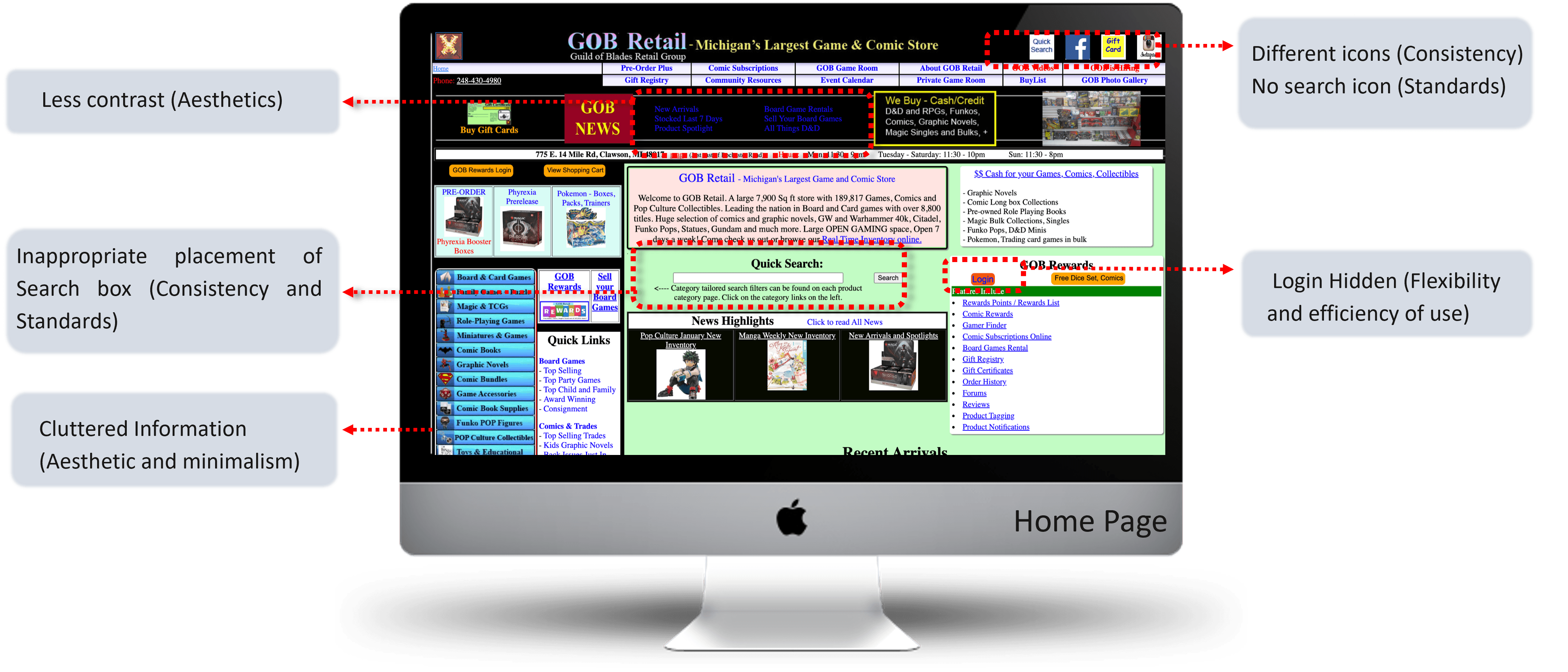
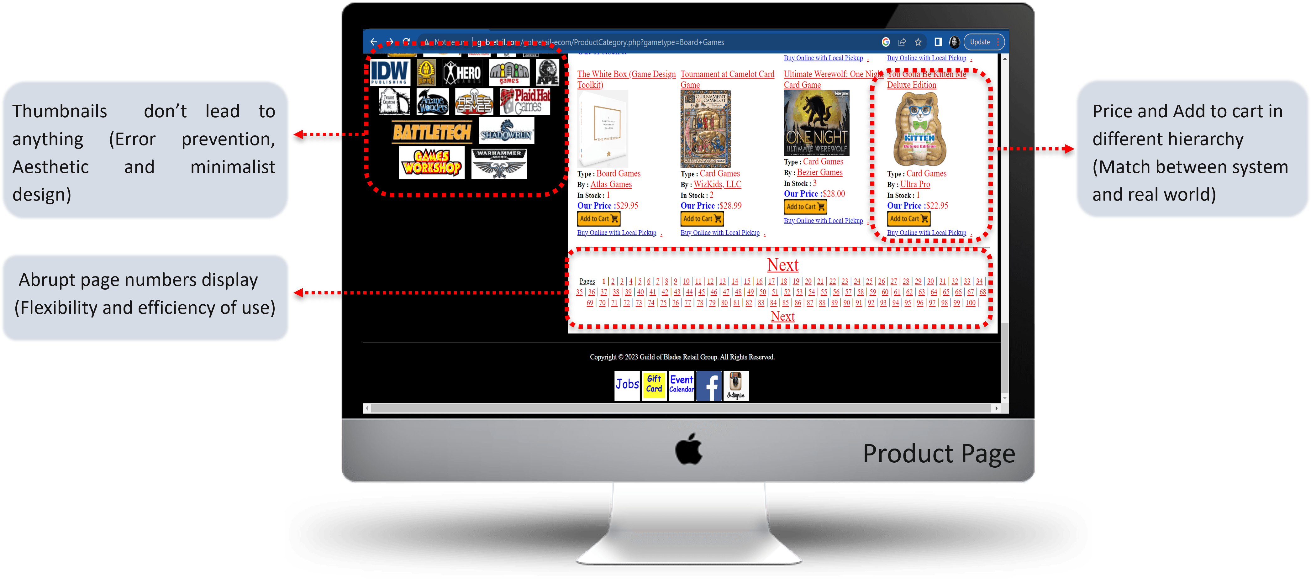
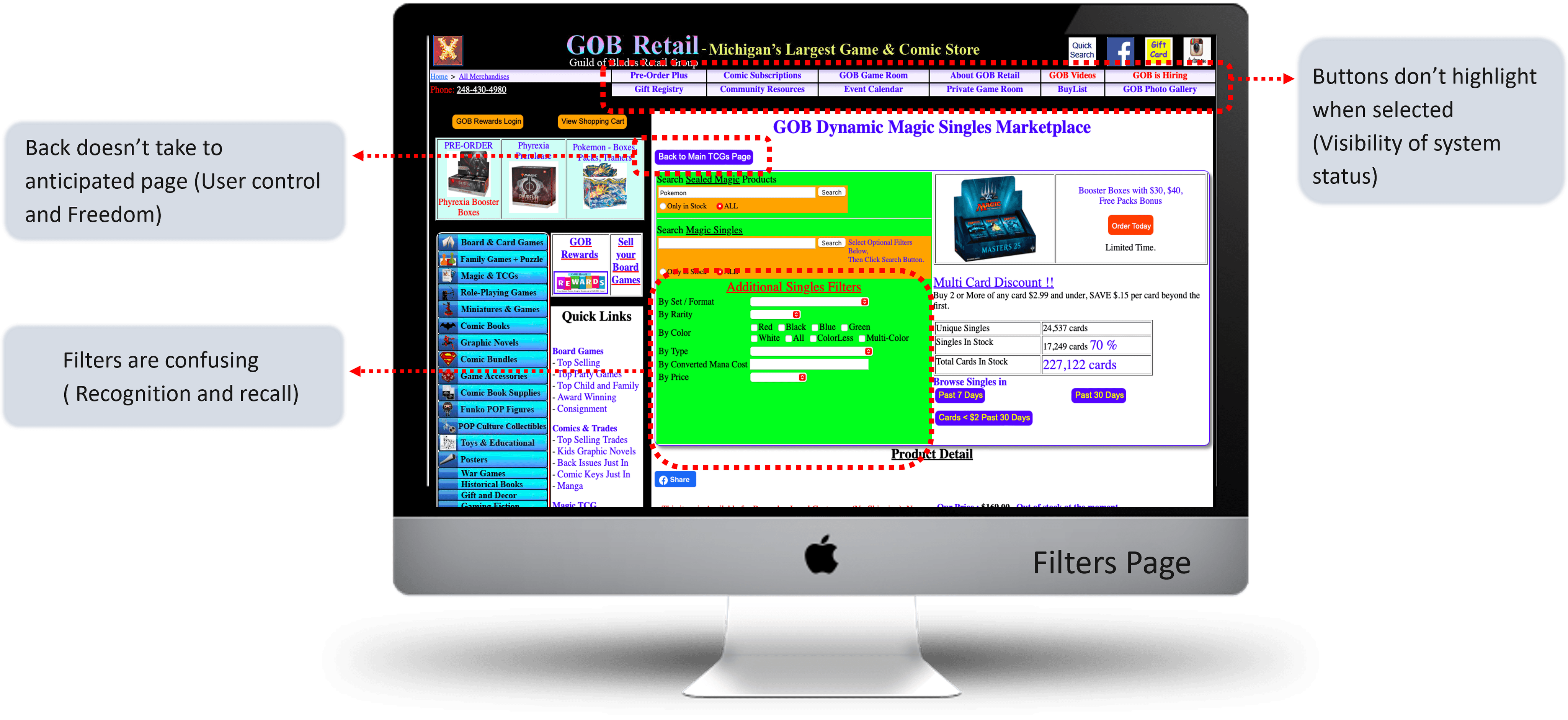
Primary research revealed three main issues: confusing navigation, a complex checkout process leading to cart abandonment, and overwhelming visual clutter.
Navigation Issues
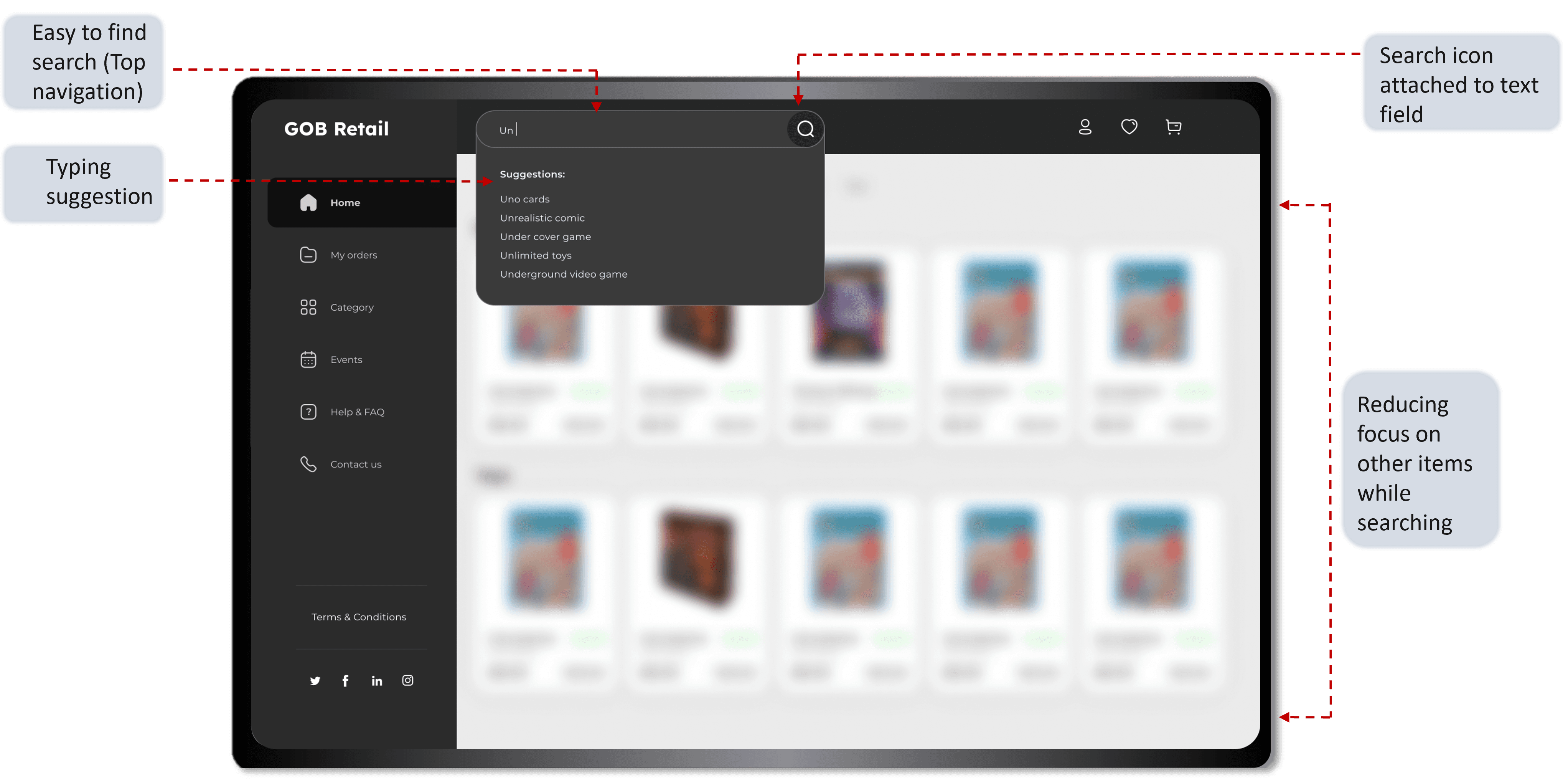
Users struggled to find specific items due to a lack of clear categories and an overcrowded menu.
Checkout Friction
The multi-step checkout process was a significant barrier, causing high cart abandonment rates.
Visual Clutter
A heavy use of colors and dense content made the site feel overwhelming and outdated.
Heuristic Evaluation
Who are the Target Users?
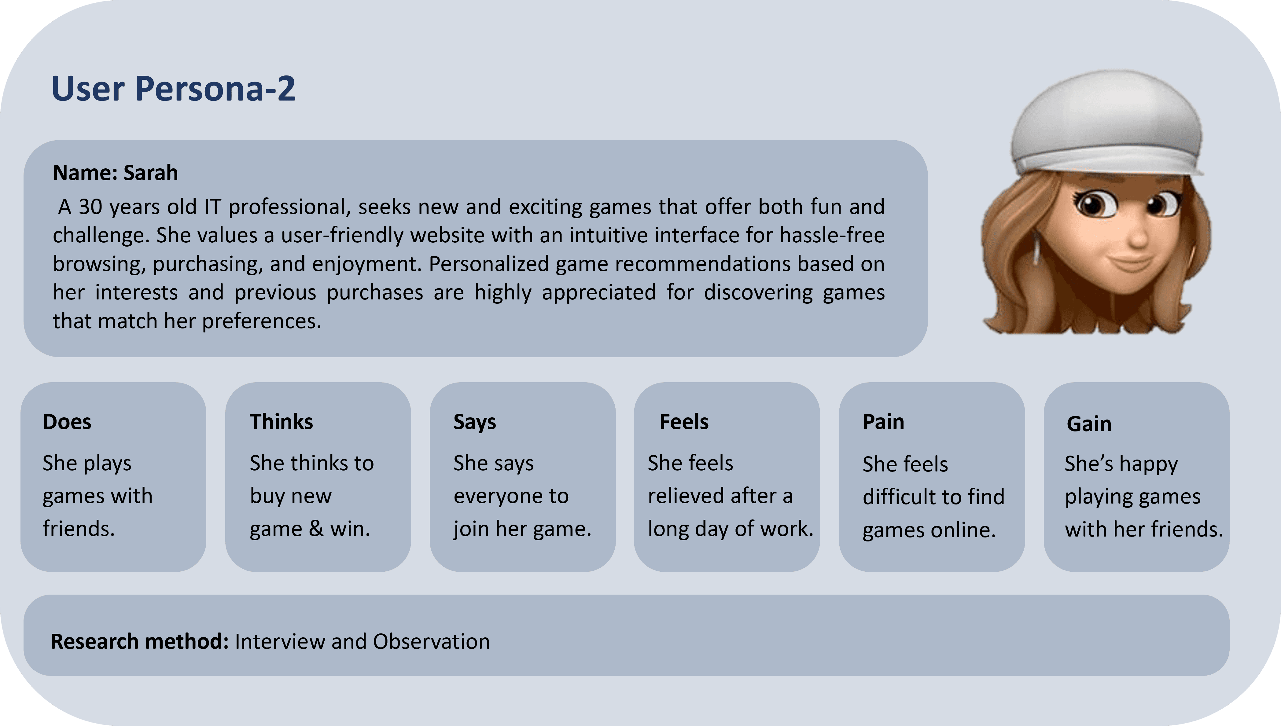
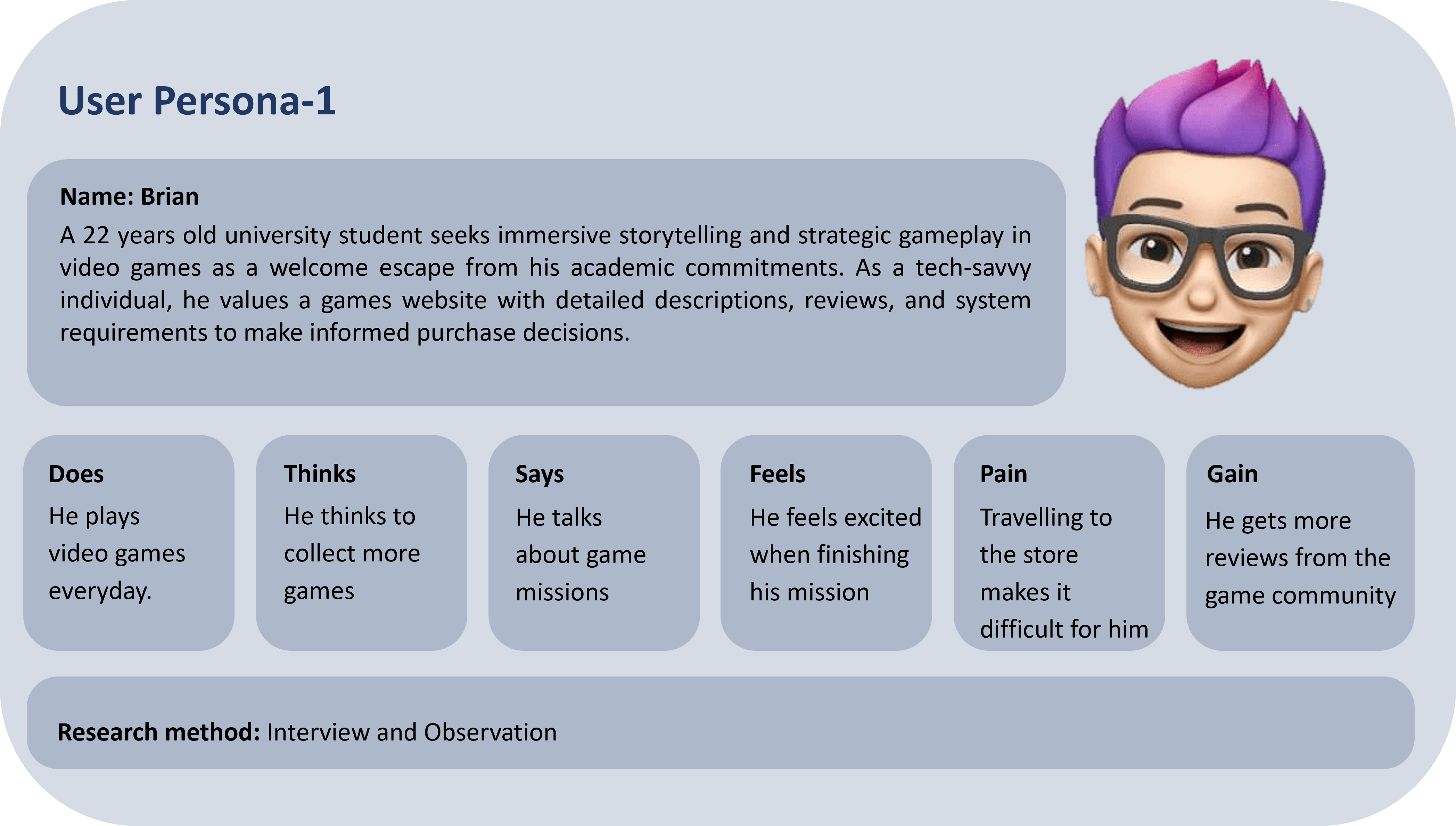
At the store, we engaged with Brian and Sarah, avid fans of Gob Retail's gaming collection. Their feedback on website usability drove improvements, aligning the online shopping experience with their gaming passion.
Task Analysis Survey - Existing Website
A study was conducted using a targeted task assessment through a digital action research approach. Eighteen individuals, aged 20 to 35, and members of a game-focused interest group, participated. They were tasked with visiting www.gobretail.com, selecting a tabletop game, adding it to their cart, proceeding to USPS checkout, and navigating back to the main page without completing the order. The study utilized Google Forms and Zoom for observation and follow-up.
76%
Rated the Website Experience as POOR
68%
More than 2 minutes time taken to find the product
88.9%
Rated checkout process to be POOR.
Information Architecture
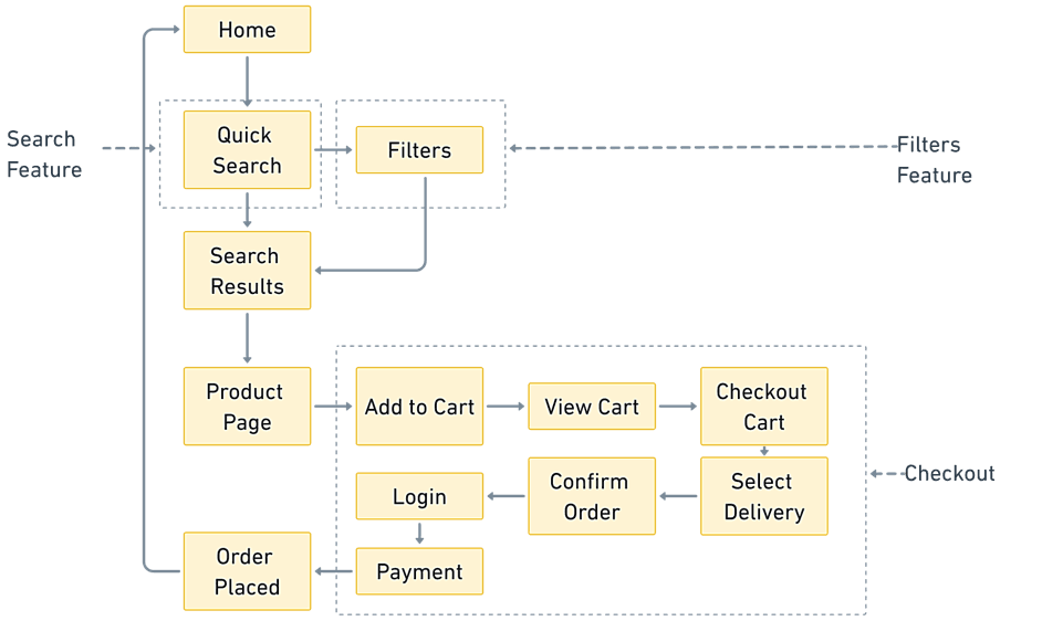
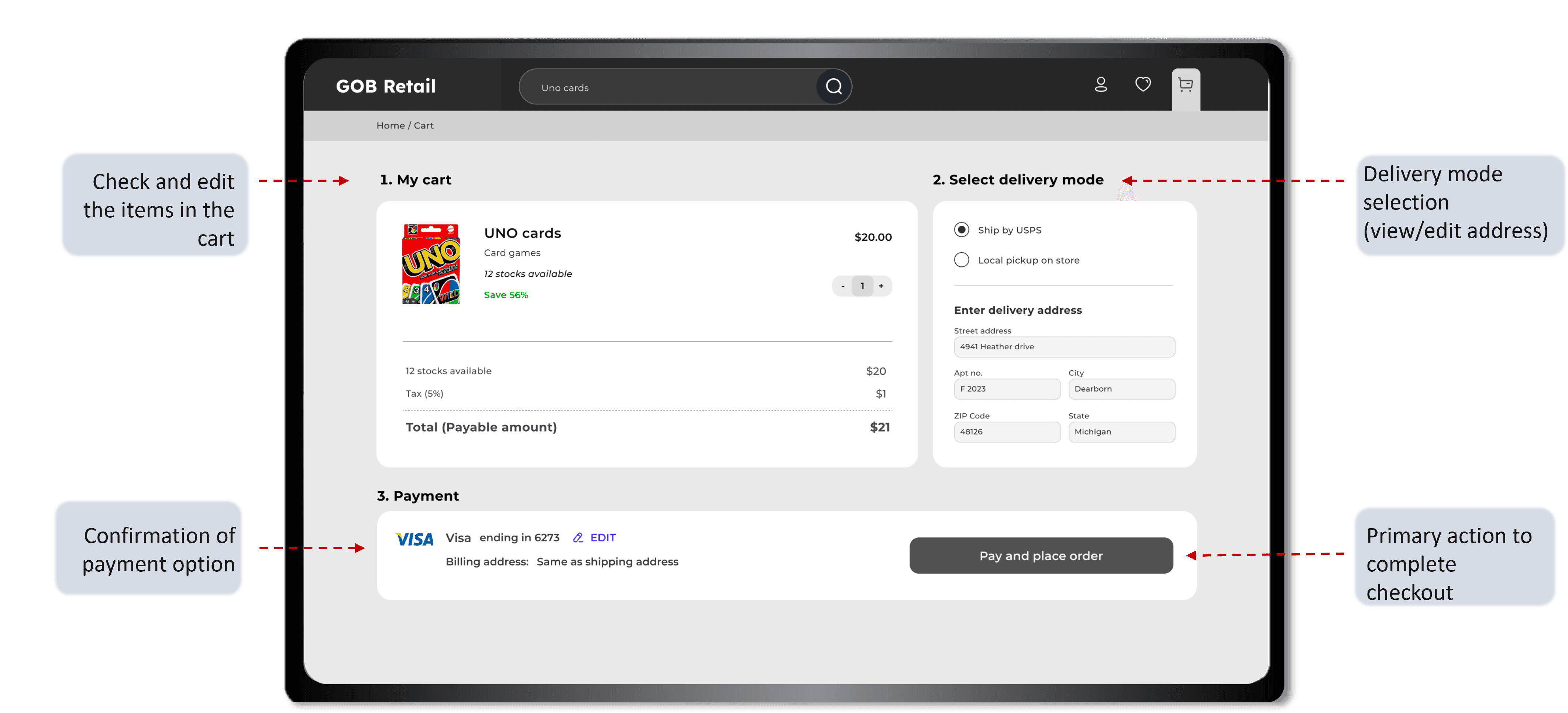
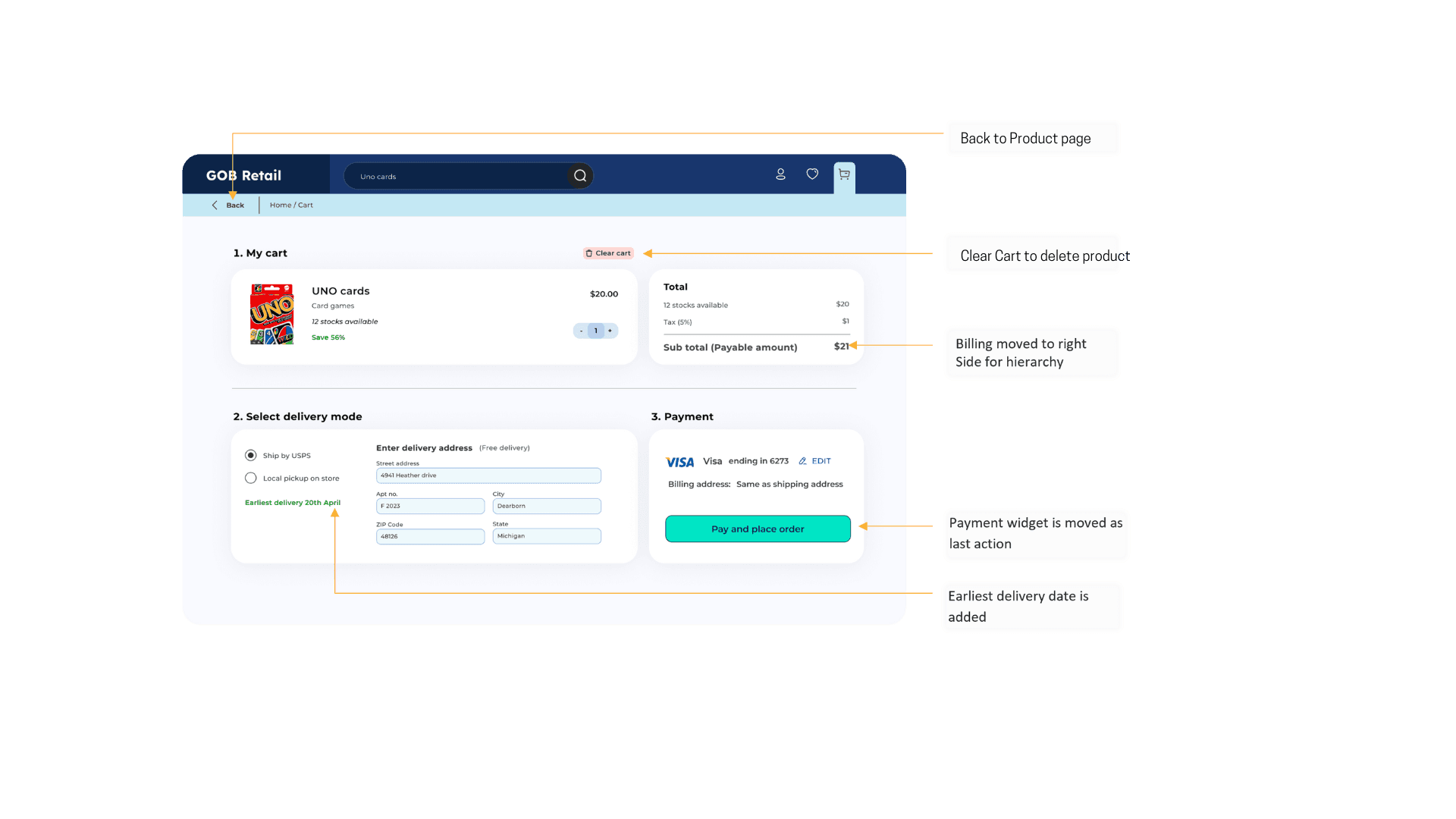
The old checkout flow was complex and multi-stepped, causing frustration and abandonment, while the new design is streamlined to reduce steps, enhancing ease of use and completion rates.
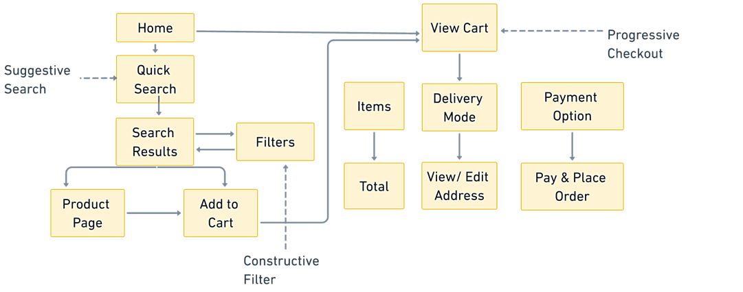
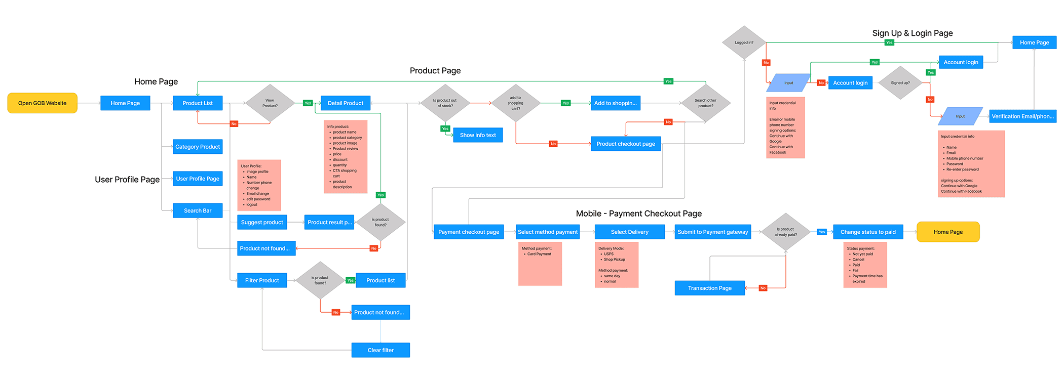
User Flow - Redesigned Website
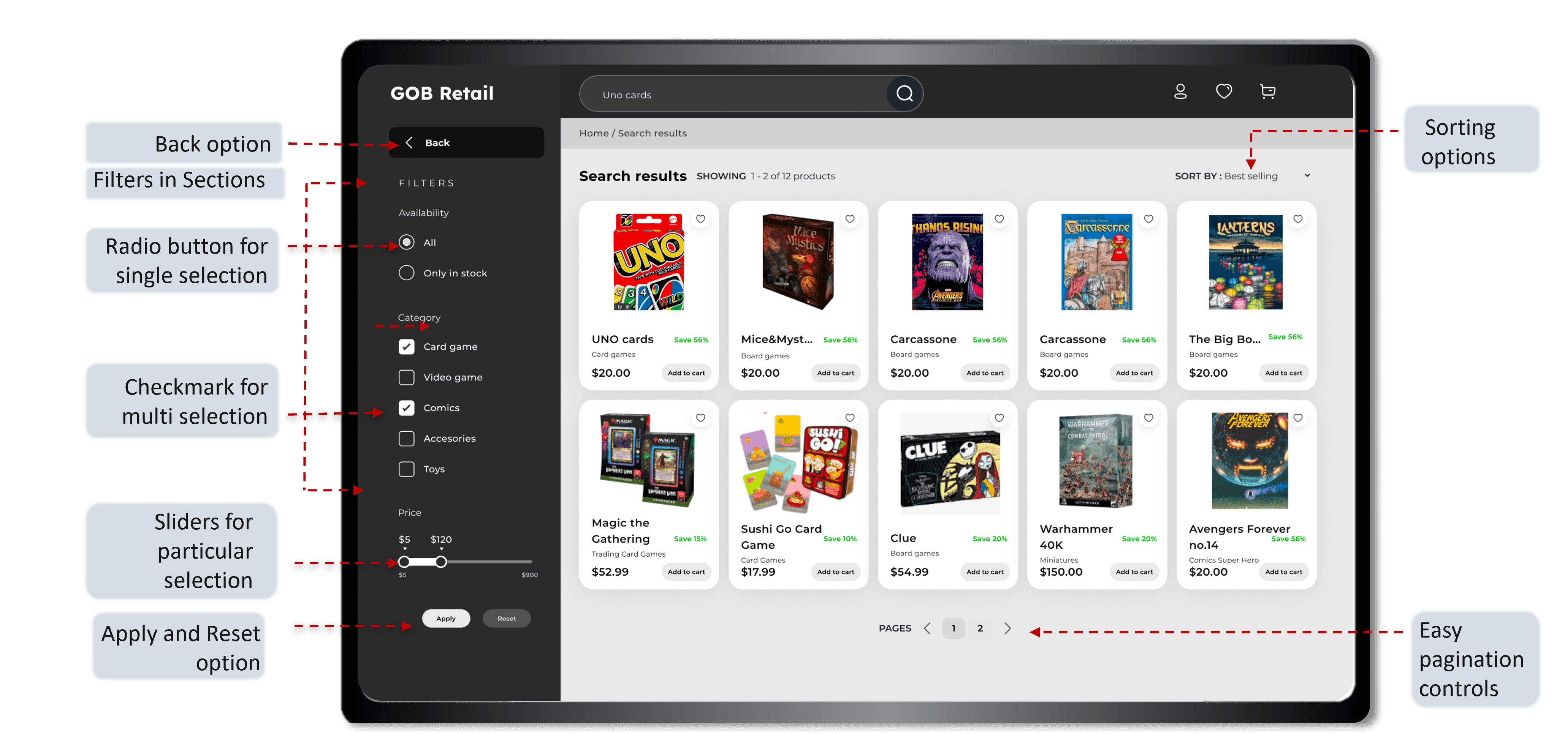
The redesigned user flow simplifies navigation, guiding users seamlessly from product discovery to checkout. Key improvements include intuitive category organization, a streamlined search function, and a quick, user-friendly checkout process. This optimized flow enhances the shopping experience, reduces friction, and encourages higher engagement and conversion.
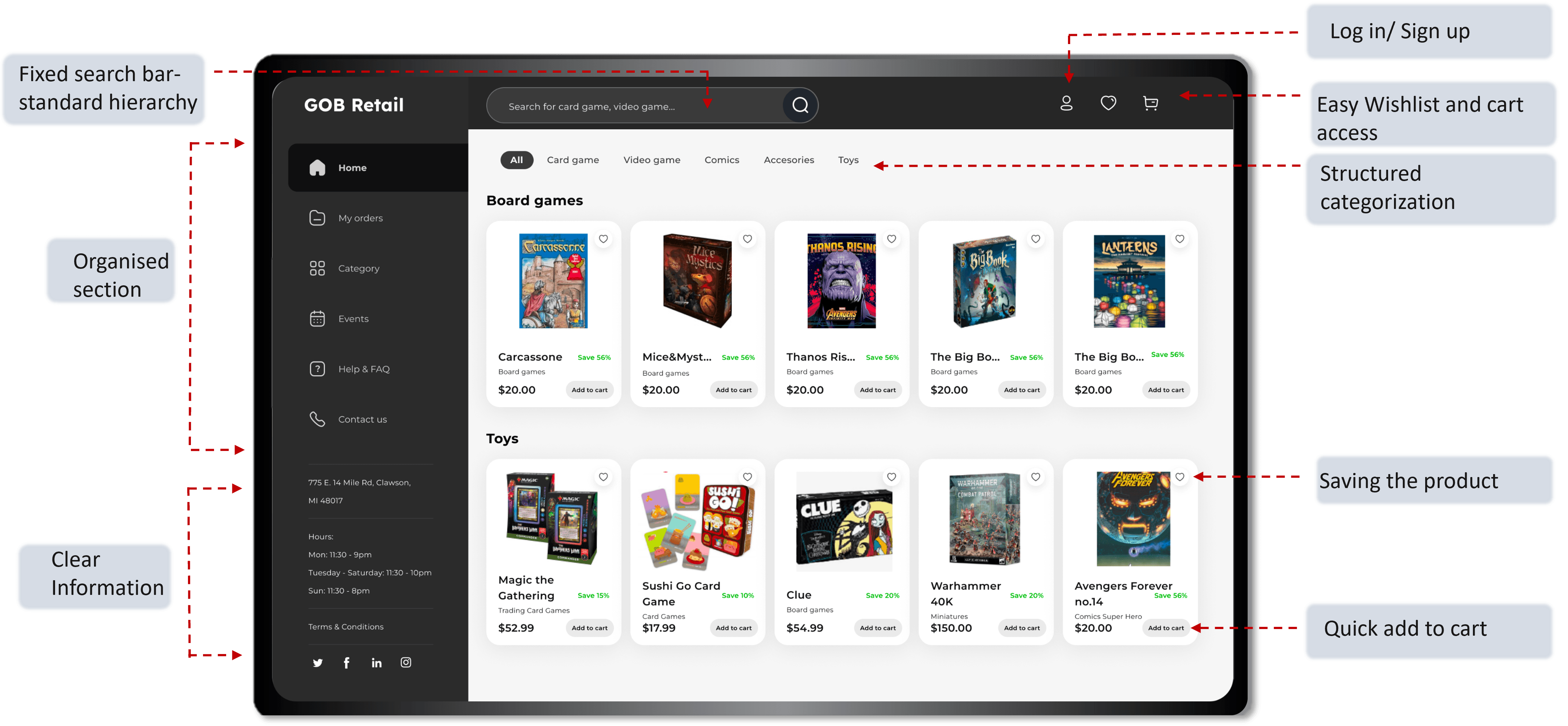
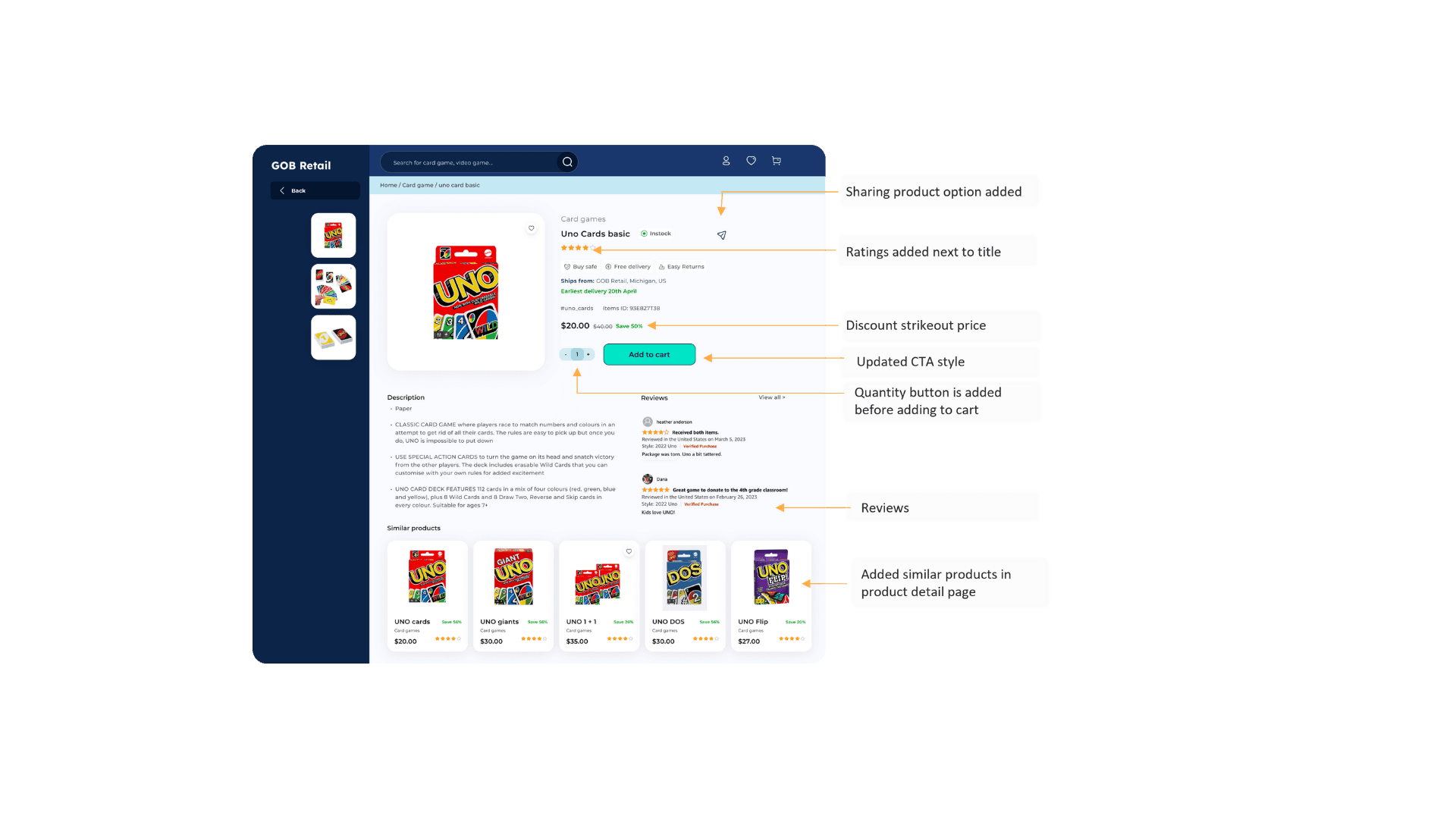
Mid-Fidelity Wireframes- Redesigned Website
Useability Evaluation
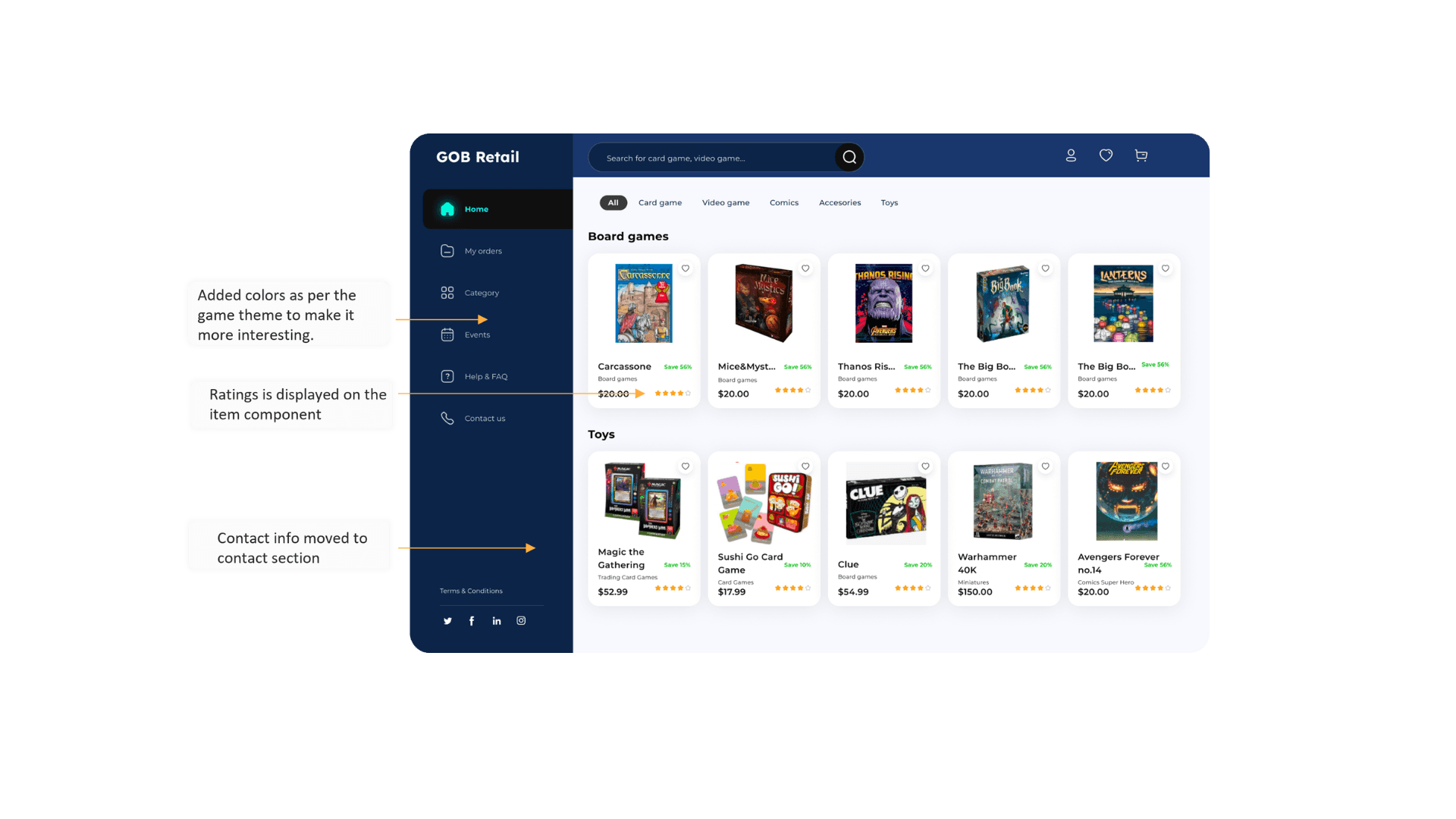
The assessment involved 10 remote users, 5 think-aloud participants, and 2 experts, focusing on improving navigation, efficiency, and learnability. While users praised the interface, they wanted more products, clearer checkout, and features like ratings and invoice downloads. Task times ranged from 20 to 50 seconds. Issues with the cart, checkout, and a dull grayscale interface underscored the need for usability enhancements.
Test Method
Remote Testing
Think Aloud Testing
Expert Evaluation
Test Goals
Evaluate the usability and user experience with focus on the checkout process.
Test Measures
SUS Remote Testing
Think Aloud Task
Qualitative Analysis
Participants
Remote Testing: 10
Think Aloud Task - 5
Expert Evaluation - 2
80%
Improved Navigation
Users could find their desired items within a minute, compared to more than 2 minutes on the previous design.
25%
Reduced Abandonment
The single-page checkout led to a 25% drop in cart abandonment during testing.
90%
Positive Visual Feedback
Users reported that the new design felt "modern" and "engaging," enhancing their shopping experience.
Design Iterations
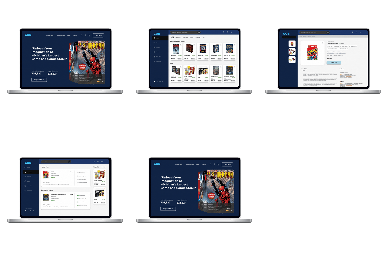
Based on the feedback, I made minor adjustments to button placements, font sizes, and added quick-access links to improve the overall flow and ease of use.
Impact
The final design achieved the goal of transforming the site into a sleek, user-friendly e-commerce platform that:
Boosted User Engagement
The simplified navigation and modern UI encouraged users to browse and shop more comfortably.
Increased Conversions
The new checkout design reduced cart abandonment, leading to a measurable increase in online conversions.
Enhanced User Satisfaction
Feedback showed a strong boost in satisfaction, with user praising streamlined experience and modern design.
Reflection
What I Learned
This project reinforced my value of a user-centered design approach and showed how even small tweaks in navigation and checkout flow can significantly impact user experience and conversions. It also highlighted the importance of iterative testing and client feedback in creating a product that genuinely resonates with users.
Next Steps
Continuous user feedback will be crucial for further refining the experience, especially as the store expands its online offerings. Future improvements may focus on personalized recommendations and AI-driven search enhancements to further streamline the user journey.


